David Tofsted, Ph.D.
In a recent article in the Las Cruces Sun News the headline shouted that sea levels could rise dramatically by the end of the 21st century. According to this report, published in a journal associated with the National Academy of Sciences, 22 “experts” predicted that sea levels could rise as much as 6 feet by 2100. Yet James Hansen in 1988 predicted that the Hudson River walk would be underwater already. That would have meant a rise of over 5 feet in 30 years. Yet here is a photo of the Hudson River Park today. [photo by Fran727, at https://www.tripadvisor.com/Attraction_Review-g60763-d4545669-Reviews-Hudson_River_Park-New_York_City_New_York.html#photos;aggregationId=101&albumid=101&filter=7&ff=78502845]
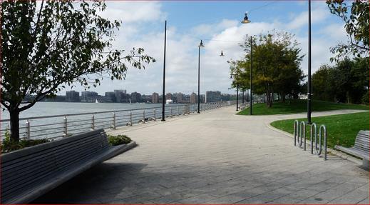
Clearly James Hansen’s [now] near-hysterical prediction has been disproven. It should be noted that Hansen was invited to present his predictions at a Washington hearing in mid-summer at a Senate hearing room where the windows had been opened for a June 23 date. In addition, Senator Tim Wirth and James Hansen had deliberately sabotaged the hearing room’s air conditioning controls to keep the room extremely hot on the day of the hearing.
These theatrics illustrate how the climate “debate” has been skewed and manipulated not based on science but based on a disingenuous narrative designed to obtain a particular result – public hysteria and panic over the seeming need to immediately spent trillions of dollars on unnecessary “fixes” to the energy industry such as solar panel and wind turbine farms, as well as attacks against the United States hydrocarbon (fossil fuel) industries of coal, oil, and natural gas.
Hansen, not a climatologist or meteorologist, worked for the NASA Goddard Institute for Space Studies (NASA-GISS). Hansen was (and is) an astronomer. It is interesting that many astronomers have been advocates for these extremist “solutions” to our climate “crisis” since astronomy typically ignores the most important dynamics of weather which are clouds and their genesis and effects on the radiation budget inside the atmosphere.
Following his 1988 testimony Hansen engaged in further efforts to prove the Anthropogenic (human-caused) Global Warming (AGW) hypothesis. As has been illustrated by Tony Heller, who goes by the web name of Steve Goddard, at RealClimateScience.com, Hansen’s GISS group proceeded to use mathematical manipulation techniques to alter various temperature records around the planet. For example, illustrated below are two graphs that amount to before and after plots of the same US temperature record based on Hansen and companies manipulations…
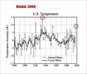
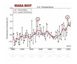
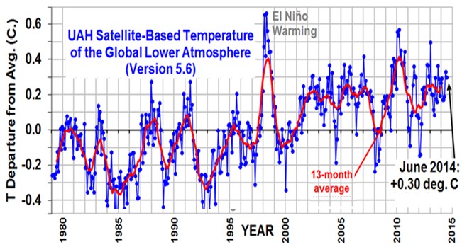
Here, these two graphics have been aligned to show them at the same scale, except that the 2017-era [version] graph of the US temperature record is shifted upwards by half a degree. What the comparison shows is that the average temperature of the 2017 graph has its temperatures of around year 2000 shifted upwards by nearly a full [1.0] degree for its “running mean temperature line” while the 1999-era graph shows a running mean of only 0.2 deg. C at its 1998 timeframe. The two circled temperatures in each graph are also out of order. In the 1999-era graph, 1934 is shown as the hottest year on record, while in the 2017-era graph 1934 has been demoted to a temperature less than 1998. The new record does not match satellite data (seen below) that shows no distinct trend from 1980-1995, while the 2017-graph shows a distinct upward trend.
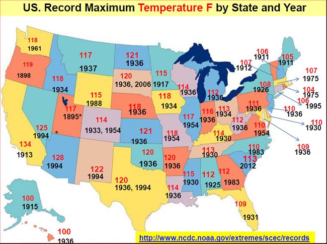
Yet 1934 is well-known as the hottest year, and the 1930’s were (and are) the hottest decade on record in the US. A map of the hottest recorded temperatures, by state, reveals that numerous temperature records were broken in the 1930’s (the dust bowl years) that have never been broken since. The 1930’s still feature twenty-three state temperature records for the hottest daytime temperatures, and this is after nearly seven more decades in which to produce new record highs. Clearly if warming trends were as significant as are reported by NASA-GISS, these temperature highs would not be listed as occurring in the 1930’s, two decades before CO2 levels increased significantly.
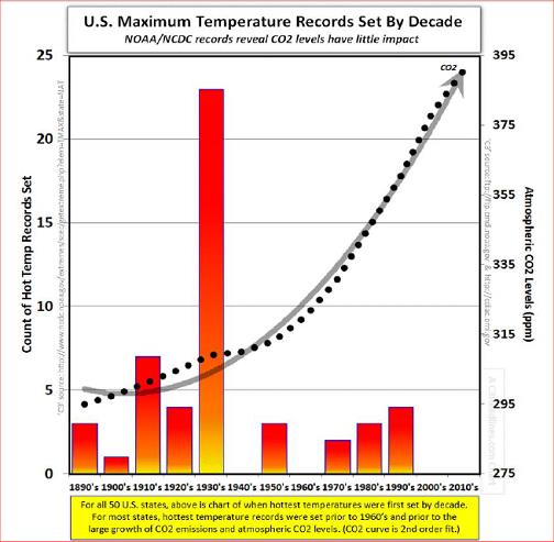
The second graph below further illustrates this issue. This bar chart plots the number of existing record high temperatures by each state, grouped according to the decade in which those highs occurred. Obviously the peak in the 1930’s illustrates how extraordinarily hot it was during the 1930’s.
Yet what is the significance of how temperatures varied in the United States when compared to the rest of the world? The answer to this is that temperature records, especially continuous records, were not the norm for most of the world up until recently. Continuous records are still not consistent throughout much of the world, particularly in Africa and South America. Also, since much of the planet is covered by oceans, land temperature records are not necessarily reflective of overall temperatures. This can lead to a lot of opportunities for less than honest data manipulations using methods termed “homogenization.” Alter the US temperature record and you’ve modified over half of the long term temperature records for the planet!
The abuse of homogenization has allowed organizations tasked with studying temperature records to is to alter recorded temperatures using biased assumptions. These assumptions result almost all the time in resulting temperature tracks that appear to artificially cool older temperature records while artificially warming more recent reported temperatures. Basically this involves adjusting reported temperatures at rural data sites upwards to match the records of more urban sites.
And here’s what is happening at the data sites themselves: Over time urban growth is encroaching on historical temperature measurement sites. What might have been rural locations in the past are becoming increasingly urbanized. And space limitations and data cabling issues are ending up with temperature sensors too close to buildings, like this site in Ohio:
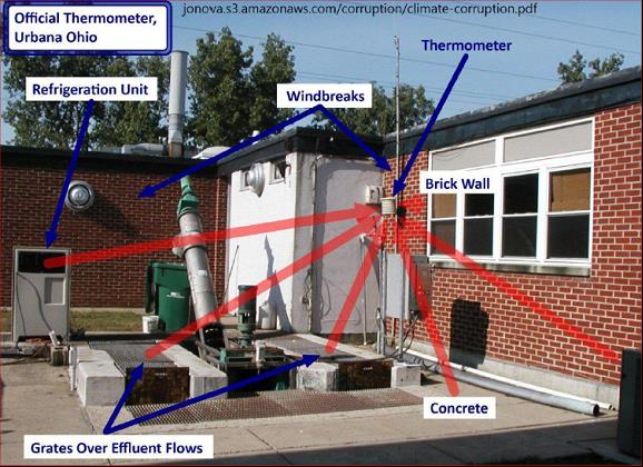
This is the official temperature measurement station of Urbana, Ohio. Why would anyone imagine that such a station, located near brick walls, etc., would not be registering higher temperatures than a more rural temperature station? Yet, likely, because it is located near a well-constructed building and because the cabling to the sensors is shorter, the data from this sensor is being collected more reliably, and therefore considered more valuable, than a more rural data set.
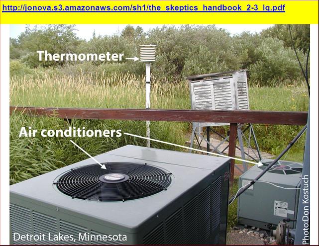
Even rural sites can become “contaminated” if they are located next to air conditioning exhaust vents, as illustrated in this photograph of the Detroit Lakes, Minnesota, temperature measurement station.
Overall, some 85% of even US temperature measurement stations feature up to 2 degrees greater temperature than well-sited measurement stations. To see what the effects of the Urban Heat Island are, let us look at this graphic from a study of California sites in urban, suburban, and rural sites.
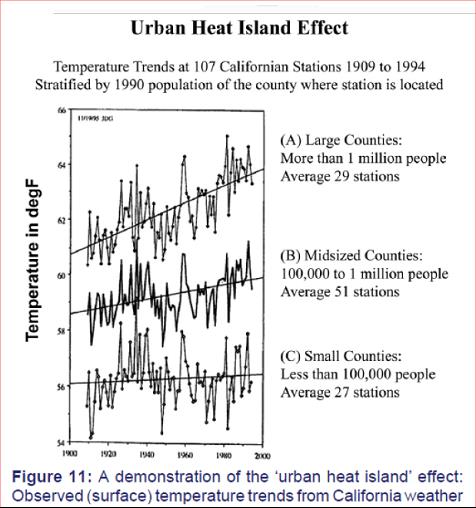
From this chart, temperatures are rising much faster in large urban counties than in more rural counties.
NOAA has also been systematically removing more rural data collection sites from its records, while retaining urban sites. Even beyond “homogenizing” rural data sets, in some cases inconvenient data is simply being dropped. For example, at the Orland, CA, site, shown in this before and after graph pair, old warmer data has been carved out:
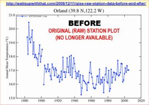
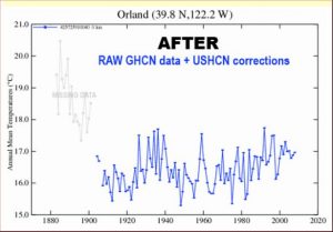
By omitting the older warm data, the remaining data now “fits” more consistently with the Global Warming narrative.
Let us now return to the Sea Level Rise hysteria of the recent story. Here (last graphic) is the trend over the past 140 years of sea levels. The scale here is in millimeters. A six foot rise in sea level between now and 2100 would require an increase of 1828 mm. As the article stated, this is over twice what the worst case United Nations estimate has been previously.
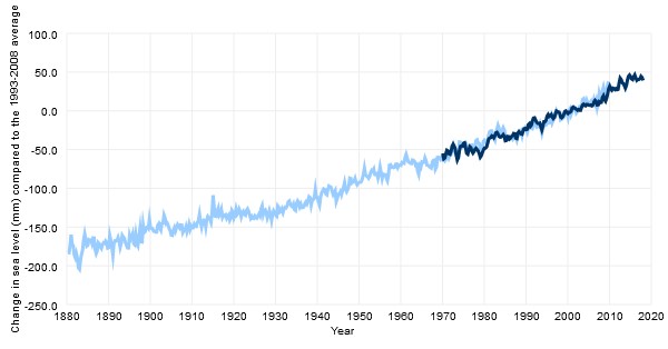
Notice that nearly 100 mm of sea level rise occurred over the period from 1880 to 1950 (70 years), and another 100 mm between 1950 and 2010 (60 years). While there may be some acceleration in the rate of rise between these two periods, to create a total sea level rise of another 1600 mm in 80 years, the average rate of rise that has averaged between 2 and 3 mm per year would need to increase to 20 mm per year, an increase of 18 mm/year to TEN times the current rate.
And where would all this water come from? Practically speaking, the Greenland ice sheet would need to begin melting at a feverish pace. And this is just not possible, given current trends.
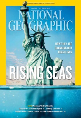
We have seen this sort of stupidity played out before. For example, this cover picture from National Geographic envisioning that the Statue of Liberty would be half drowned. [See https://wattsupwiththat.com/2013/08/20/national-geographics-junk-science-how-long-will-it-take-for-sea-level-rise-to-reach-midway-up-the-statue-of-liberty/ .] This would require almost the entire Greenland ice sheet to melt.
What if we could actually have an honest and real debate about the environment and man’s role? What if we could stop the hyperbole and hysteria that often substitutes for real debate on these issues?
If even a formerly respectable publication like National Geographic, along with our National Academy of Sciences, cannot be trusted to give us a straight discussion, where are we headed as a country?
I, for one, do not believe that it is conservatives who are not dealing with reality. There may be problems in our environment, like overfishing, and pollution of our rivers by pesticides and fertilizers, much of it going to waste to produce corn-based ethanol that costs $5.00 per gallon to produce, provides less miles per gallon fuel efficiency than regular gasoline, and is taking up over one-third of our farmlands in the Midwest. Likewise, we have wind and solar farms that are highly subsidized but produce power only a third of the time, are unreliable, and wear out in 20-25 years, that is in less time than the loans needed to pay them off. If our desire is to replace fossil fuels (and maybe this is a good idea in light of the coming ice age when we will need reliable energy), then why not do it with reliable nuclear power?
We have seen where these hyperbolic dire predictions have ended in the past. None have become true. We see where the trend lines are now. There is no chance that these will become reality even in the distant future of the end of this century. And we can see that alarmists continue to issue such dire warnings over and over, with ever more extreme predictions, and ever more misleading claims.

